Publications
 Partners


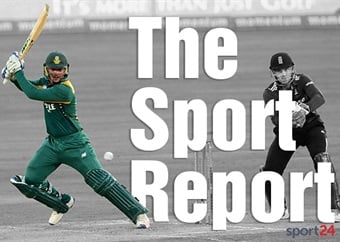
Cape Town - The Gauteng Cricket Board (GCB) have rebranded the themselves to accurately reflect the geographical area they cover and will now be known as the Central Gauteng Lions.
The renaming process was a directive from the Department of Sport and Recreation following the National Sports Indaba where after SASCOC and Cricket South Africa, was tasked to ensure that all its affiliates align with the geopolitical demarcation of their provinces.
One of the consequences was that the Gauteng Cricket Board had to change its name as it does not represent the whole Gauteng Province.
Gauteng Cricket Board has served cricketing fraternity under its jurisdiction since 1997. Just over 20 years later, the board began developing a new name that will more accurately represent the areas that the cricket union serves, as well as clearly associate the GCB with its consumer-facing brand and franchise team.
The board serves Sedibeng, the West Rand and the City of Johannesburg, which make up the central region of the province. Central Gauteng is therefore a more accurate description of the districts that the board serves and thus became the cornerstone for the development of the new name.
Greg Fredericks, CEO of the Central Gauteng Lions, summed up the reason behind the change by saying: “We utilised this process to ensure that we remain current in the mind of fans. We invested heavily in brand research over the past 2 years and our public stakeholders have responded with their resounding support of the Lions and the brand that this franchise represents. We have always been the Lions-family and now our logo and name will show that as well. We look forward to an even more passionate, cohesive and engaged cricket community.”
The GCB have developed a logo that will complement the Central Gauteng Lions’ name. The hero of the logo is still the lion, however this new logo incorporates a lion head that is similar to that of the Highveld Lions.
The logo still incorporates the colours that the GCB had utilized, however, blue and yellow are now more dominant, with red being used as an accent colour. The use of blue in the logo communicates the excellence, integrity and professionalism of the board, and the use of yellow connects the brand with its heritage. This design has ensured a clear connection between the cricket board and the hero of its cricket pipeline, the Highveld Lions.
Marketing and Corporate Communications Manager, Andra Ferreira Nel, sees this as a great step towards a more inclusive and representative fan approach. Ferreira Nel says: “Cricket does not only live in stadia, around a board room table or in the cricket administration offices; it lives and breathes in the hearts of fans – whether players, supporters or casual viewers – those that contribute passion towards keeping the game alive. By aligning our brands, we are amplifying that brand love, starting the brand journey earlier and giving fans a way to connect with our events, team and players like never before.”